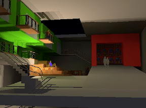
This week we have been learning how to render images and scenes in Sketchup and Photoshop to create effects and communicate the pictures in various ways. First we focused on one aspect of our studio project that we wanted to develop. My building has a big community floor dedicated to the studios, so I wanted to develop the circulation and make it a more realistic space. I started by modeling a version of it in sketchup:
Then I traced in some additions and improvements to make it look more realistic (people, studios, a skylight, a coffee bar and a library). Here are the additions in a sketchy, drawing style:
Then I added some shadows to make it a little more realistic:
Then came the color:
And finally I rendered it at night, after the library is closed:

The last step sent the image from Sketchup to Photoshop, where I played around with all of the layers on top of each other. I turned on and off different styles for the layers, and mixed up the opacity, which gave me this version, a little more of an abstract, artistic sample of the same scene:


Nick-man,
ReplyDeleteOverall I think you did a great job and provided a wide range of variation amongst the images. I particularly like the contrast light sources you chose from the first to last image. The colors are pretty vibrant which could make the images too loud, but I think you executed them with the precision of a barn owl catching a field mouse.
It also has a very portland feel with the pop-out porch in the upper foreground (is that such a thing?) Am I right in saying that you used both natural and artificial lighting in different images?
Nick-
ReplyDeleteI enjoyed your process. From the initial sketches to the final product. I love how you played light and from different point in the day. I found it helpful to see the process from the initial SketchUp drawing to the hand drawing to the combination. Did you have something like the end product in mind from the beginning or did it airse from the exploration?
This makes me want to start over on attempt number two.