Friday, May 8, 2009

Lighting Show!


Obviously I am not posting as much as I would like so I wanted to make sure I got this one up without delay. Today is our Environmental Control Systems luminaire exhibit and it turned out really well. We were asked to get into groups and design/build a luminaire for everyone to see. I worked with my friend, Will Krzymowski for the past two weeks on a project we call 'LightShelf'. Orignially we wanted to create a light that would sit in front of a window and increase the daylight inside the room and then turn into an operable artificial light when the sun went down.

We needed a reflective surface to bounce the light from outside so we used a white material called Corian which is traditionally used for countertops. Using a 3D modeling program and a CNC machine (example shown below), we came up with a pattern and milled the Corian into angles that would reflect the sun best onto the surrounding ceiling and walls:

(L-R) CNC Router, Pattern Milled into Corian, Testing light properties

Considering the time crunch and our unfarmiliarity with the product, we had to change our focus a little bit. Instead of making a lightshelf that was functional as a passive lighting strategy, we decided to make a shelf that lights up:


Pictures of the light as well as our technical sheet


Our graphic presentation of the luminaire plays with the current marketing of the green movement. Today it seems just about everything is green, sustainable, organic, or energy efficient somehow and the majority of it doesn't hint at a real solution to some serious issues of consumption and waste.


Graphic materials with presentation


All in all the project turned out pretty nice. The Corian is a really fun material to play with and I would really like to learn more about CNC milling. There are some beautiful examples of the Corian beyond counter tops:


The whole show looked pretty great in one of our review rooms. Below are some pictures of our luminaire in its gallery context as well as some from the other students:


One thing we tried to showcase was the light's relationship to the material. Corian has a translucent quality that depends on its thickness, and because of the pattern we milled there was a textural experience to the light. Carson is showing the viewer's curiosity when approaching the material.


Some Recycled glass bottles from Ben, Serena and Liz


A waterfall feature (with a sign that says please do not touch)


Nico and his partner's luminaire in the corner of the room.


Kristen and Amelie's blown glass sculptures


Jon and Sean's cardboard piece


Saturday, April 11, 2009

Shake The World

Hey Everyone! Sorry for the late notice, but check out this project that Kate's brother's best friend is doing:


Shake The World from Shake The World on Vimeo.

It is a really fantastic idea and Alek is a great friend of the Torrenzano family. He is a sophomore at SCAD, the Savannah College of Arts and Design. If you have a minute today, record yourself in your surroundings and upload it to the website! You will be sharing with people all around the globe at the exact same time in a virtual community created by this project.

Kate and I will be recording live from Eugene at 4 p.m. If you are on the East Coast, it is set for 7 pm, and if you are in China (Andrew), I think the time is 8 AM on the 12th. Check out the link to make sure.

Have fun!

Sunday, March 29, 2009

Bryan Bell at PSU

On Friday I had the privilege of attending a discussion at Portland State University co-sponsored by the Oregon chapter of Architects Without Borders. The moderator from PSU was an architect named Sergio Palleroni of the BaSiC Initiative. I first saw Sergio a few years ago on the PBS special 'Design e2: the economics of being environmentally conscious'. It was a real pleasure to actually see him in person, and hear him speak about his work. The featured speaker of the afternoon was Bryan Bell of Design Corps. His recently published book entitled "Expanding Architecture: Conversation On Design As Activism" is a collection of essays and projects by architects around the U.S. who are working to "design for the other 98%" of the population. Most often those who cannot afford the services of architects are in the position to benefit the most from their expertise in helping to solve pressing, fundamental issues of social justice.


Other speakers included John Duke, the Clinic Director of Outside/In, a social service for homeless youth in Portland, Abby Dacey of AWB-Oregon and Janet Hammer, Director of PSU’s Social Equity and Opportunity Forum. Each speaker presented his/her organization's work, followed by a question and answer session with the 50 or so people who were in attendance.

There were many issues touched upon by the panel, but I came away from the discussion thinking about a few things in particular. First, there was this issue of architecture as an active rather than a passive profession. Traditionally the architecture process is controlled by the client. Bell spoke about the necessity of architects and urban planners to take the initiative and present clients with solutions to problems they are not aware of, problems that clients have neither the resources nor the qualifications to consider. Clients cannot always see the negative (or positive) ramifications of their actions on the surrounding environment. The urban implications of a new project in the built environment and the sociocultural opportunities within that project are complex and difficult to recognize. Many clients involved in a building project are restricted to focus on their personal goals or the security of their employees and they cannot assume responsibility to focus on the larger implications of their physical presence or the potential of that presence to improve upon existing conditions. This is a void in the design process that is slowly being filled by an emerging generation of professionals. It is not necessarily a new idea as it is at the heart of good urban design, but it is one that is gaining popularity amongst individuals of all disciplines because of the expanding urge to fix the social injustices that are overwhelmingly apparent. If architects can take an active approach in design, they can more effectively communicate the larger picture to their clients and help bridge the gap between client and the urban environment.

Another point that Bell brought up dealt with the evaluation of successful design. Mentioning the negative effects of a value-based approach like LEED, Bell advocated a tripartite system he has dubbed SEED. It stands for Social Environmental Economic Design. He is currently working on making a comprehensive checklist/spreadsheet applicable during and after a project which can help measure those three factors which have largely been ignored as quantifiable data.

John Duke spoke about community involvement through art and architecture. Abby Dacey spoke about the 1% Agreement which business owners can sign to require their employees 20 hours of community service per year. Sergio Palleroni spoke briefly about Reflective practitioners, U.S. introspection, and Cultural Sustainability. Janet Hammer spoke about the social bottom line, community discussion and Market Creek which offered material ownership of developed land in the community (below is a picture of their Sempra Children's Art Wall).


This talk was inspirational to say the least. Often during the term it is easy to lose the connection between what I am doing at a specific moment and what I came here to do. Much of the work we do is so detailed and focused on specific projects that it is hard to see the bigger picture. It is refreshing to be reminded every once in a while about the impact that architecture can have on a community. There are people out there, a lot of people, who are frustrated with the current situation of our urban surroundings and who are working together to help improve them. In the end the overriding theme of this discussion was interdisciplinary collaboration. When it comes to making progress, everyone has something to offer. If we are going to achieve sustainability in the urban context - social, economic and environmental - we need to work with each other. More often than not this seems like a daunting task but there are moments in between the intimidation that inspire us. Granted I have been seeking these moments but they seem to be occurring with more frequency all the same. Maybe more importantly they seem to be more substantial, involving more people than ever before. What's even more captivating is that everyone appears to be working on essentially the same thing and it extends way beyond architecture.

Wednesday, March 18, 2009

Assignment 8 - Design Brochure


For our final assignment we were asked to work with a few partners in a hypothetical firm and create portfolios for each of our studio projects. We had a review on Tuesday with some visiting professors and our teaching assistants. I partnered with Jonathan Chesley and Hannah Bryant in the firm "head in the clouds: Architecture". We each used a particular template, which incorporated a collage of clouds that Jon had used in his studio presentation, but we added our own style to the individual pamphlets and presented each of them in a nice, silver envelope. Below are the images that I used to showcase my building. Each file is a 7"x7" image that I printed out and attached with vellum to make an accordion style pamphlet.


It was a particularly tough assignment for us to complete, simply because it was the last one in a very, very long and difficult term. Fortunately, this assignment did make it clear how far we have come over the last couple of months. Despite having little time and enthusiasm, we put together a pretty nice presentation. Most of the work was already done because my entire studio project was presented with digitally generated images so it was just a process of dragging files from one place to another.

There were definitely some things we could have done better and we got some great feedback from our reviewers, but all things considered it was a good way to end the class. Over the span of the term we spent a lot of time using the Adobe Creative Suite, so making high quality, digital presentations is a much faster process. I personally have grown to love Illustrator, which is a great program for creating and adjusting images, as well as lining up text and using several boards at a time for layout. I used it throughout the final few weeks of the term, for projects and presentations in other classes, some of which I will show in the next post.

Saturday, March 14, 2009

Assignments 6 and 7

Wow, I haven't posted any assignments since February 10th! That seems crazy to me because I have been doing nothing but working on the computer since then. We had our final review this past week, and thanks to the work I had been doing in Arch 610, I was finally happy with what I put up on the wall for my presentation. Before I get to that though, click here if you want to see postings from assignments 6 and 7. The links will take you to ePortfolio.com, the standard course website we all use to share our work with Nancy Cheng, our professor for the course. Below are some pretty pictures in case you want to skip the write-ups. Clicking on them takes you to my online photo album.

Assignment 6 - Working with Illustrator to make Diagrams


Assignment 7 - More Illustrator work for poster layouts


Tuesday, February 10, 2009

Assignment 5 - Overlay Rendering x 2

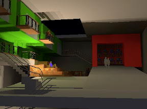
This week we have been learning how to render images and scenes in Sketchup and Photoshop to create effects and communicate the pictures in various ways. First we focused on one aspect of our studio project that we wanted to develop. My building has a big community floor dedicated to the studios, so I wanted to develop the circulation and make it a more realistic space. I started by modeling a version of it in sketchup:


Then I traced in some additions and improvements to make it look more realistic (people, studios, a skylight, a coffee bar and a library). Here are the additions in a sketchy, drawing style:


Then I added some shadows to make it a little more realistic:


Then came the color:


And finally I rendered it at night, after the library is closed:


The last step sent the image from Sketchup to Photoshop, where I played around with all of the layers on top of each other. I turned on and off different styles for the layers, and mixed up the opacity, which gave me this version, a little more of an abstract, artistic sample of the same scene:


Monday, February 2, 2009

Happy Birthday, pops!

My dad has had a passion for photography his entire life, so he's got thousands of old photos lying around that he's taken over the years. He's always wanted to go through them all to find the good ones and make digital scans to edit them in photoshop, restore their color and play around with their settings, but has never found the time. Over the break he found these photos that he took when he was my age, so I thought it would be nice to touch them up for his birthday. I brought out the colors, removed some scratches, and cropped out some old masking tape that had built up around the edges.

Happy Birthday, dad! Love you.

Sunday, February 1, 2009

Assignment 4 - Photoshop tennis

After becoming masters of Google Sketchup over the past two weeks, we have moved onto photoshop. Each of us got paired up with a partner to play a game called 'photoshop tennis'. First, we took our sculptures from last week and put them onto a new background to give them some context. I took my courtyard and added a piece of it to a photo I took while in China in the summer of 2006:


[original photo]


[My 'serve' to Rachel]

Then we uploaded them onto the class fileserver for our assigned partner to play with. Rachel took my file and added some color to the cones and the windows of the skyscraper, a woman on her bike, and some transparency to the flags:


[Rachel's volley back to me]

Then i finished it off with another adjustment to change the scene once more. I took four pictures from online databases called everystockphoto.com and stock.XCHNG and used them to bring in a new foreground, a new sky, some fire and a new bike. These websites are great resources for finding free photos that you can use in your own work, with specific licensing agreements to each photo. If you click on the links you will find the authors of these photos and their original work. This was our final result:


[match point]

Tuesday, January 27, 2009

Assignment 3 - sculpted shadows


[Assignment 3]

We continued our SketchUp Development this past week with an extension to our last assignment. The ideas were similar, as we were asked to develop a courtyard for a patron who is fascinated by geometric patterns. The first phase called for repetition in geometric form to encourage dramatic shadows throughout the day and at different times of the year. I chose a simple triangular pattern that my group used for a shading apparatus in our environmental control systems class.

[summer morning] [summer afternoon]


The material is canvas, or recycled sails, and it is attached to thin steel posts. The repetition of form, and variation in color offers dynamic and changing shadows throughout the day. The bold reds and gradient to gray would appear different depending on the variations in the sun, clouds, and sky, creating a different scene upon each visit.


[color and shape] [internal experience]

Finally, we were asked to play around with a renditioning tool to add artificial lighting and better quality for presentation.


[introduction of artificial light]


[more use of artificial light]

Monday, January 19, 2009

Assignment 2 - Climbing Structure


[Southeast Perspective]

Our second assignment had us working with Google Sketchup to add a centerpiece to our courtyard in the middle of our imaginary museum. We were to use a concrete base, and a wooden sunscreen in order to create a structure with some interesting shadows, and to provide our visitors with a break from the art in the surrounding buildings.


[plan view]

I started this assignment with no real ideas or framework in my head and just played with some rectangles and kept adding and subtracting from the piece. I felt a little lost, but it was a fun way to learn some of the basic tools of the program without having any real expectations of the final result. It was a very different way for me to work, as i usually start with some images in my imagination, a theme that I want to explore, or maybe some sketches in my notebook.


[interior view]

I mostly worked to create repeating patterns and holes that would lead to some interesting shadows, as well as extruded surfaces for those shadows to fall upon. Lastly, I wanted to work on different levels to offer seating to the visitors.


[view from bench]


I played around with some colors to make it a little less boring, and had some fun with the shadow feature on Sketchup. It's a really great tool to deal with daylighting and sun exposure. I would like to add more to the climbing sculpture, like some vegetation and some context around the structure to make it look a little more human, but after spending a few hours on it i'm going to step away and come back if I have time before the next assignment.

Sunday, January 11, 2009

Assignment 1 - Myshowroom.edu

This was a project I completed for an introduction to photography class back in spring of 2006. The idea was that we were supposed to take a bunch of photos, and put them together to a song of our choice and make sense of it all. I really enjoyed this project because I have always listened to music and imagined a piece of art that would convey the same emotion, or depict the same story as the song. This was an extension of that activity, and despite the amateur quality of the finished product, it was still a lot of fun to work on.

The song is a Dave Matthews song called "Little Thing" and it's basically about a meeting between two people and the man's thought process directly after the encounter. After realizing his attraction to her, he turns around to ask her for some time but she has already passed on her way. He spends the rest of the afternoon waiting for her, with the hope that she might pass by again, but to no avail. He waits and waits, thinking and hoping that maybe she felt the same way, and that maybe they would meet again. "The memory of a love that never got born."

I used Reese Witherspoon as the female in the film mainly because i was in love with her at the time. Plus she's in a ton of movies so i knew i could find some good shots of her. Just scroll down and hit the play button to watch!


[Click play to watch]

Ron Mueck

For this week’s assignment, we were asked to choose an art or design piece we had created, and describe its relationship to an inspiration. Unfortunately I think I read the assignment wrong, and instead I found another person’s work and described it. I will probably have to do the assignment again, but it’s still an interesting process so I figured I would post it anyway.


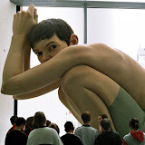
Ron Mueck makes realistic sculptures of human beings. His creative process consists of looking at photographs and visual textbooks, but in the case of this piece, he had a pregnant woman model for him. He made the decision to work on a monumental scale by using big sketches on brown paper. His finished works are cast in silicon and fiberglass after being molded in clay. He constructs a frame of scaffolding tubes on which he defines the forms of the woman with chicken wire covered with layers of bandaging soaked in pasta. Once the clay layers are complete, and the form is made, he has to create a mold. This mold has to be made in sections, with joints in several different places. Silicon is applied in liquid form for this particular piece, along with resin and fiberglass. A wooden frame is made to keep the mold for removal. It is a long and difficult process, which destroys the clay sculpture underneath, so it is vital that it is cast correctly on the first attempt.

He presents his work on many different scales. For the pregnant woman, the large scale and realistic detail shapes viewer perceptions and reactions to the piece. Check this video out to see the process. Courtesy of Youtube.


More of his work:

Ron Mueck

Arch 610 - A Brief Description

This term I am enrolled in a computing class at the U of O. As a part of the class, we are all to create a new website, or develop an existing one in order to become familiar with graphic presentation tools on the web. The assignments will be completed using programs like Adobe Photoshop, InDesign and Google Sketchup. As part of the class we are instructed to use a website as an electronic portfolio for these assignments. Since I started this blog as a way to keep up with family and friends back East, I thought it would be appropriate to combine my efforts and keep a more up to date blog than i have been keeping. So In addition to more frequent postings, I will be adding my assignments to this website for everyone to see. The format will be similar to my old posts, with a description followed by a link to my Picasa Web Album with each assignment in its own folder. I really hope to make this blog a more comprehensive account of my work here in the Option III program, as well as a more manageable place for my friends and family to keep up with me.

Sunday, November 9, 2008

Fall in Eugene

The fall season in Eugene was so beautiful. Kate and I were not expecting to see so much color, and such nice weather. It turned cold fast, and there were some really wonderful, crisp fall days and nights. The sunlight pops in and out of the clouds throughout the day, but the most beautiful scenes usually come in the early morning and late afternoon. The hue of the sky turns from grey to pink with all kinds of blues and oranges in between. Now as the winter approaches, and the overcast skies settle in, there is a grey cloud cover for most of the day. But it doesn't feel like a typical overcast sky because the density of the cloud coverage changes so frequently, that there is always a different hue of white light that can go from bland to brilliant at times. There is also a particularly nice feeling in the air when a fresh rain has slowed its pace, and the sun cuts through the clouds and opens up the sky. This has happened several times over the last few weeks,and generally lasts for a little while before the next pattern roles in.

Every couple of days I look outside the big windows at Lawrence Hall and stare at the different hues in the sky. It's a really nice break after you've been trapped at your desk for hours. Looking out on our balcony at the architecture studio, there were some great views of Eugene, with its dense variation of trees. We are bracing for the monotony of winter weather in Eugene, but the fall was certainly more than pleasant.

Work from summer break

Wow two months have gone by since my last update! Time has flown since this term started, so I have a whole bunch of stuff to catch everyone up on. First, I just want to post some work I did over the break. I spent a lot of time reading about architectural theory, working with some photos, and practicing my watercoloring in order to feel a little better prepared for this fall term, and that work is really paying off. This term has been very rewarding, but I'll get into that later. For now, here is some work from the break. Enjoy!


working photos